Article
How to design an impact report people actually read
Design for the reader with five minutes, not the one with an afternoon.

Co-founder and CEO
· 2 min read
Key takeaways
- Most readers skim, so design the report for five minutes, with the depth behind it for those who want it.
- Lead with what changed and why it matters, not the organisation's history.
- Three key figures and one human story are remembered longer than pages of statistics.
- Publish the key findings as a web page as well as a PDF, so people, search engines and AI tools can find them.
- Plan the spin-off assets at the brief stage, not after the report is finished.
Contents
Organisations spend months on impact reports. Data, interviews, approvals, design, more approvals. Then the PDF goes out, gets a polite LinkedIn post, and most people read the first page, if that.
We've designed reports, playbooks and guides for international organisations and foundations for years. The ones that get read have a few things in common, and almost none of it is about making them prettier.
Name the readers first
A funder deciding on renewal. A partner looking for a reason to work with you. A journalist hunting for one number. Your own board. They want different things, and almost none of them will read forty pages front to back. Design for the person with five minutes, and put the depth behind it for the person with an afternoon.
Lead with what changed
Many reports open with a letter from leadership, then the history, then the method, and reach the results on page twelve. Flip it. Page one should say what changed, for whom and why it matters. A reader who stops there should still leave with the point.
Three numbers and one story
A page of statistics blurs together. Choose the three figures that matter most and give each one room. Then tell one human story properly: a person, a place, a before and after. That's what people remember and repeat in meetings you're not in.
Make it easy to skim
- Headings that say something. “Incomes rose in every district” rather than “Outcomes”.
- A summary page with the key findings up front.
- Pull quotes and callouts for the lines you want people to share.
- Charts that make one point each, with that point written as the title.
Don't let it live only in a PDF
A PDF is hard to find, hard to read on a phone and hard for search engines and AI assistants to quote. Publish the key findings as a proper web page, with the full report as a download. Then people asking questions about your sector can actually find your work.
Plan the spin-offs in the brief
The report is the source, not the only output. Plan the summary, the social cards, the slides for your next talk and the email to funders alongside the report itself. At the brief stage that's a few extra assets. Afterwards, it's a second project.
If you have a report coming up, book a call. We'll help you plan it so it gets read, and give you everything you need to share it.
Questions, answered.
What should an impact report include?
A one-page summary of what changed and for whom, three key figures, at least one human story, your method in brief, and a clear next step for funders or partners.
Should an impact report be a PDF or a web page?
Both. Publish the key findings as a web page so people, search engines and AI tools can find them, and offer the full designed report as a PDF download.

About the author
Co-founder and CEO
Sydney Sam is co-founder and CEO of Workspace Global, which has given growing teams on-demand creative support since 2015. Sydney writes about creative operations, leadership and building teams across the UK and Ghana.
LinkedInKeep reading
Article
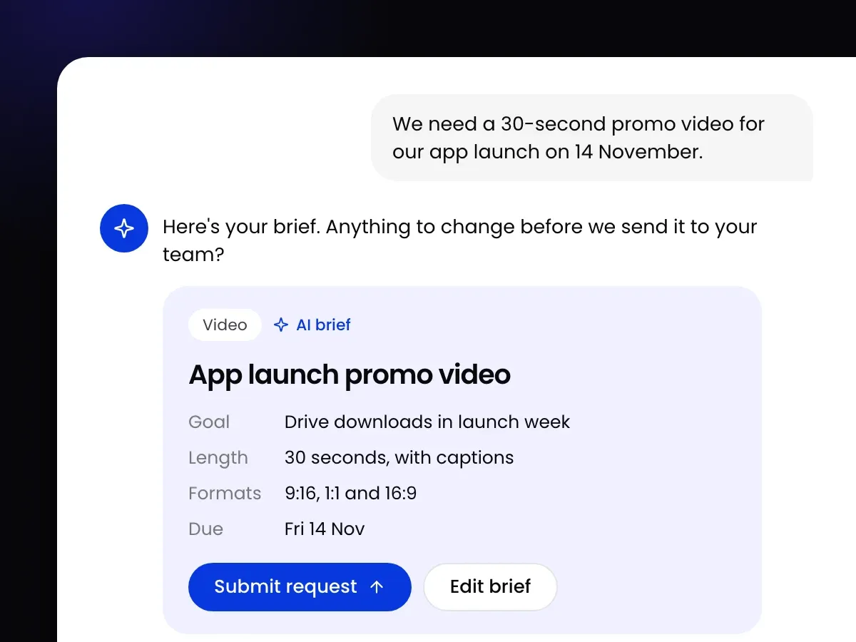
Creative brief template: how to write a brief that gets it right first time
A free creative brief template, and what to put in each section so the first draft lands close and revision rounds get smaller.
Sydney Sam · · 3 min read

Article
Pitch deck design: what investors notice before you say a word
Investors form a view of your company before the meeting starts. How to design a pitch deck, and everything around it, that earns their attention.
Sydney Sam · · 2 min read

Article
60% of creative briefs arrive incomplete: what our request data shows
60% of briefs arrive incomplete, the median turnaround is 3 days and requests take up to 4 revision rounds. What our data shows, and what to do about it.
Sydney Sam · · 3 min read